THE LAST DITCH

The Last Ditch: Parish notice.

Survey
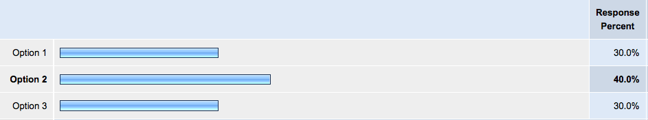
Thank you for your votes and your comments on the new banner for The Last Ditch when it moves to China. The vote was not particularly conclusive. My own preference was option 3, but in responding to the suggestion that I needed a lofty overview in the style of the current banner, I seem to have lost the Chinese aspect altogether! Not that the blog will be about China. As a mere guest, that would be rude. Still, there should be some reference to my new home.

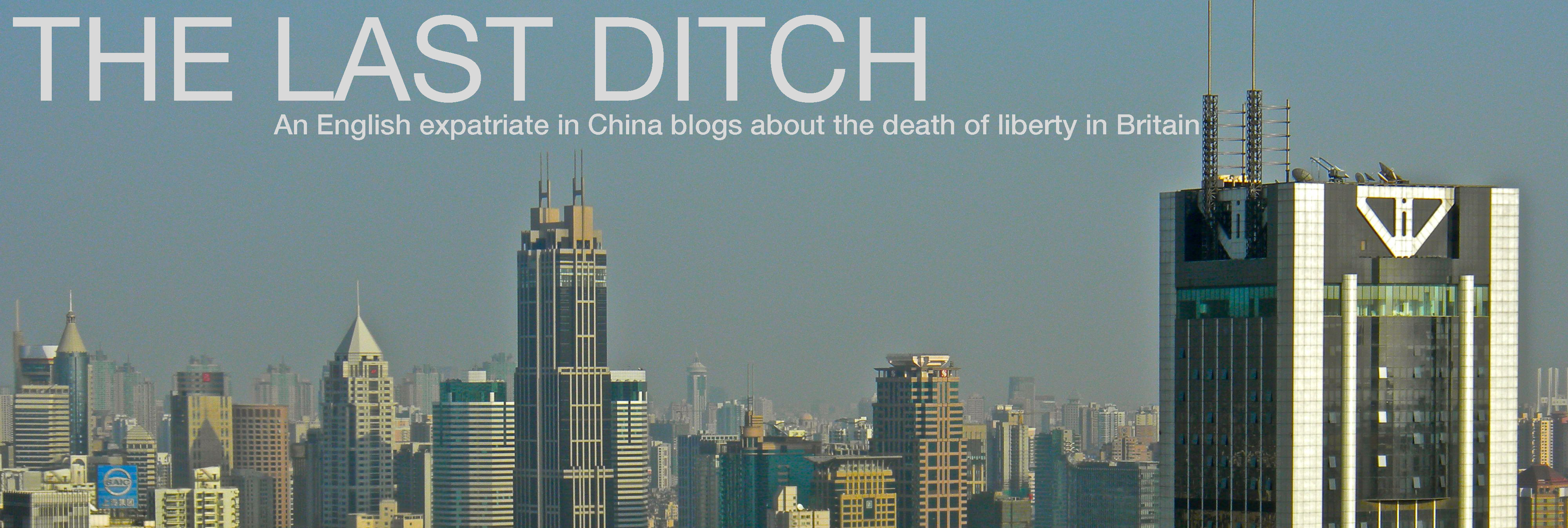
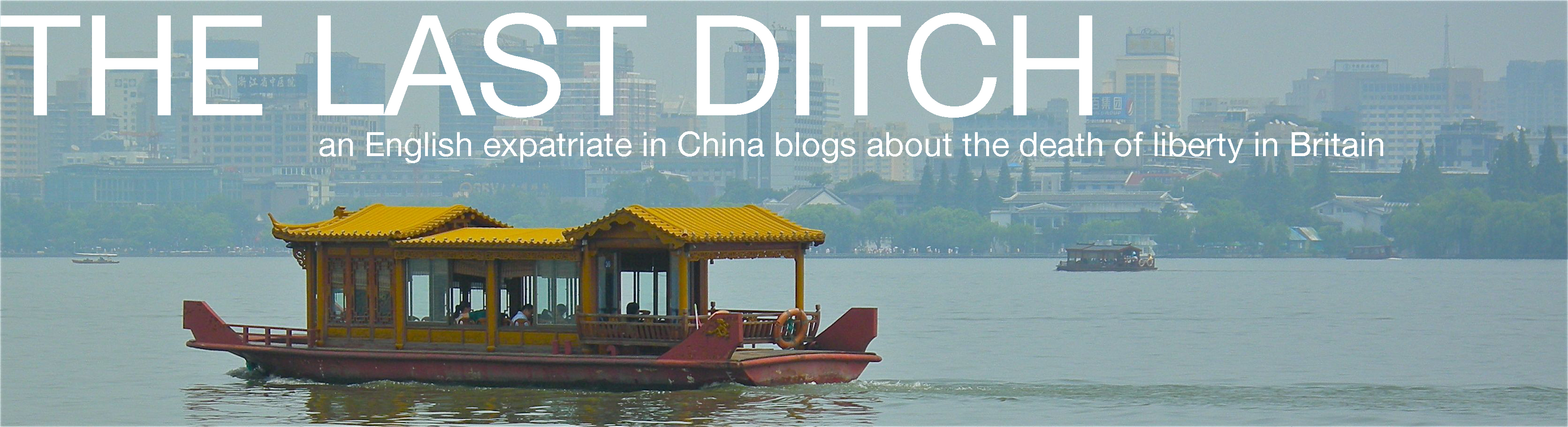
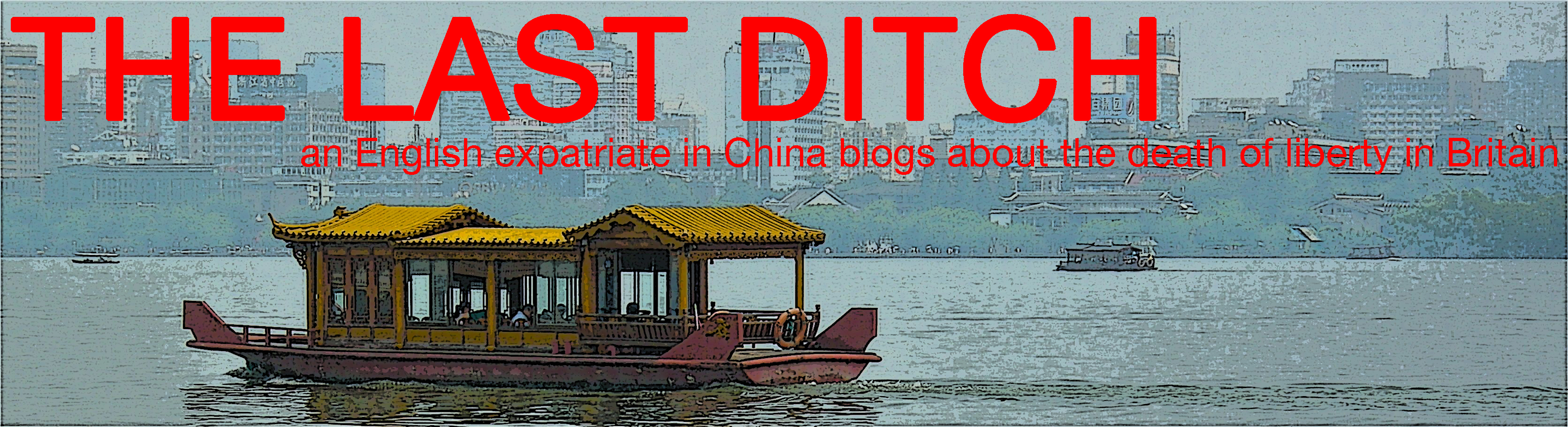
For this round, I have eliminated Option 1 (which no-one but me likes). I have taken the text from Option 2 and applied it to the Shanghai skyline of Option 3. And I have added a new one (in photo and poster versions) which is a picture of Hangzhou, showing the old China against the background of the new.

Just click on any picture to enlarge it. Am I there yet? Comments please! Then I promise I will resume normal service.

Option A

LDBanner3 

Option B

LDBannerHangzhou1txt 

Option C

LDBannerHangzhou1aTXT

13 responses to “Parish notice No. 2”

  1. Mr Eugenides Avatar

    Certainly not C, I’d say – I find the red lettering a little jarring and the effect you’ve applied on the photo a little jarring.
    B is probably the nicest, but as I said before it depends what image of China you particularly wish to emphasise.
    It’s probably worth noting, in passing, that B is instantly recognisable as Chinese in the same way that your current banner is instantly redolent of Russia. A, by contrast, is much more generic, and could easily be Hong Kong, Seoul or Singapore at a casual glance – or, for that matter, Melbourne or Dubai – to those who hadn’t been there.

    Like

  2. ContraTory Avatar

    Option B is very tasteful.

    Like

  3. Andrew Duffin Avatar
    Andrew Duffin

    B gets my vote.
    A doesn’t seem to feature anything “traditionally” Chinese, and C is too garish and discordant in colour.

    Like

  4. Moggsy Avatar

    I guess would go with option 2. I know three is more lucky being red from a chinese point of view, but it does carry political freight from a western one… and i figure your readers are mostly western.

    Like

  5. jameshigham Avatar

    N2 – go for it!

    Like

  6. JMB Avatar

    Thank goodness, finally much better choices.
    I shall also weigh in number two. I don’t mind the effect in option three but I hate the red lettering even though red is my favourite colour. I could be persuaded to number two lettering with number three image as it makes the water and the skyline clearer. But then we all know about the foggy pollution haze which envelopes the cities there so perhaps it is best to be authentic.

    Like

  7. English Guy Avatar

    A is too tall. Won’t see much of your blog without a scroll.
    B is excellent – my choice
    C is using red text which just puts off readers, IMO.

    Like

  8. CT Avatar
    CT

    Option 1 please but whichever wins would you bring the smaller text over to the left margin?

    Like

  9. Lord T Avatar

    Pity there was not something with a particularly Chinese skyline or even a Chinese junk rather than that piece of junk. 🙂
    btw : Interesting methodology you are using to select these titles.

    Like

  10. Ginro Avatar

    Not a criticism of your writing, but a criticism of China, maybe you should choose a picture from this site –
    Pollution in China

    Like

  11. Fay Levoir Avatar
    Fay Levoir

    How about using the nice pagolla? over looking the lake. I saw that picture someplace

    Like

  12. Young Mr. Brown Avatar

    Personally, I like A. But I guess I’m outvoted.

    Like

Leave a reply to Andrew Duffin Cancel reply

Tom is a retired international lawyer. He was a partner in a City of London law firm and spent almost twenty years abroad serving clients from all over the world.

Returning to London on retirement in 2011, he was dismayed to discover how much liberty had been lost in the UK while he was away.

He’s a classical liberal (libertarian, if you must) who, like his illustrious namesake, considers that

“…government even in its best state is but a necessary evil; in its worst state an intolerable one.”

Latest comments
  1. Lord T's avatar
  2. tom.paine's avatar
  3. Lord T's avatar
  4. tom.paine's avatar
  5. Lord T's avatar